
I love a lot of things about Minor League Baseball (I am actually in the second year right now of a two year research project about minor league baseball and how it relates to the communities that they are in) and one of my favorite tings about MiLB is their plethora of logos. Sports logos are fascinating and with over 160 Minor League and Independent League teams, the amount of baseball logos are incredible. Naturally, the first thing I looked at when I found the Mets were sending their AAA team to Buffalo was their logo. 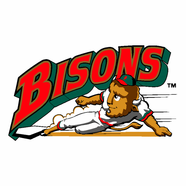
Now, in my opinion, this logo is pretty weak. Its an entertaining picture but as a logo its pretty lacking. However, they recently revealed their new logo:

This logo is just awesome. That Bison looks incredible and it really plays well to New York with the not only the city skyline, but its on a baseball, just like the Mets. This is the attitude I like to see in a logo. Usually new logos leave something to be desired because they do not have that classic feal but this logo just sends off energy, a lot more than the previous logo.


